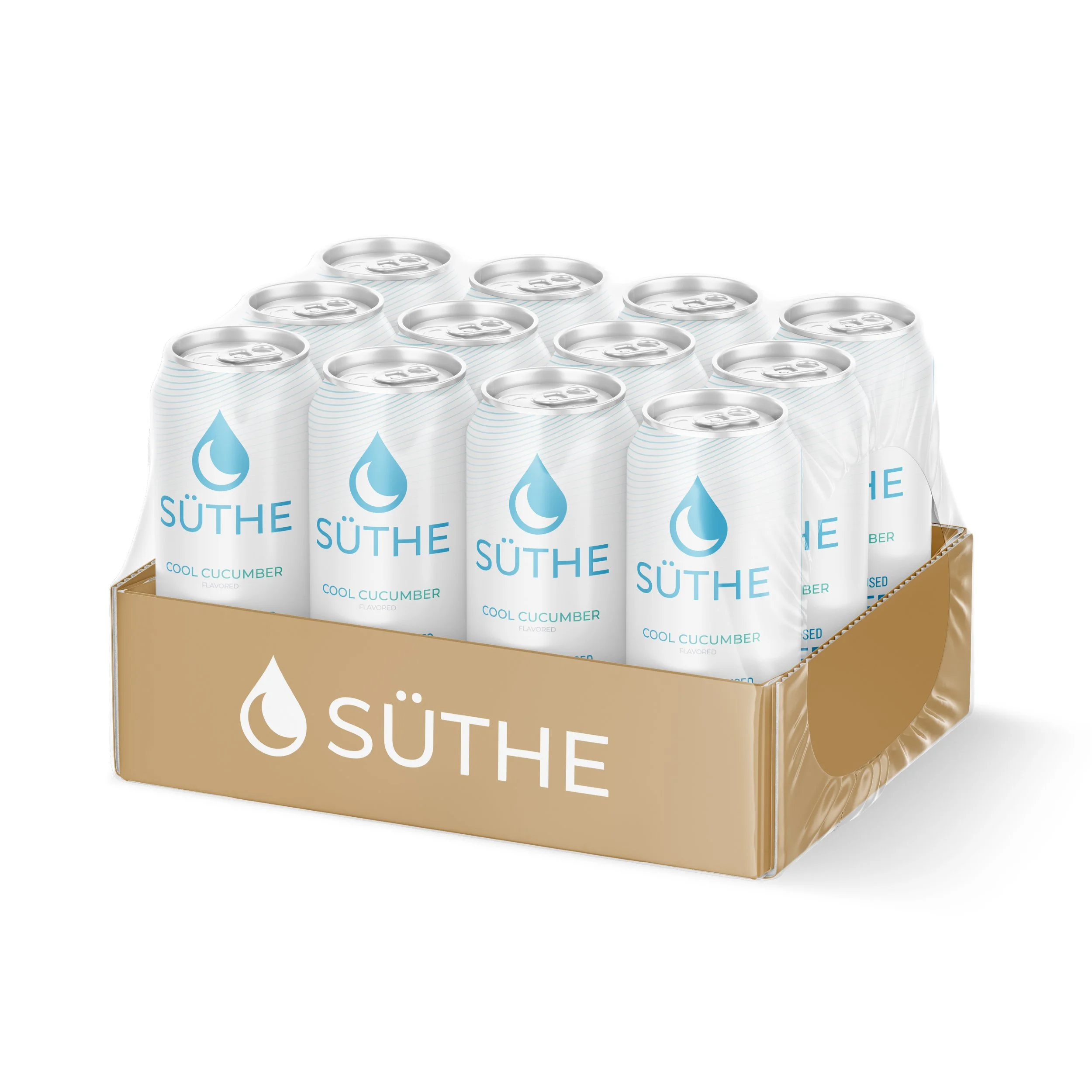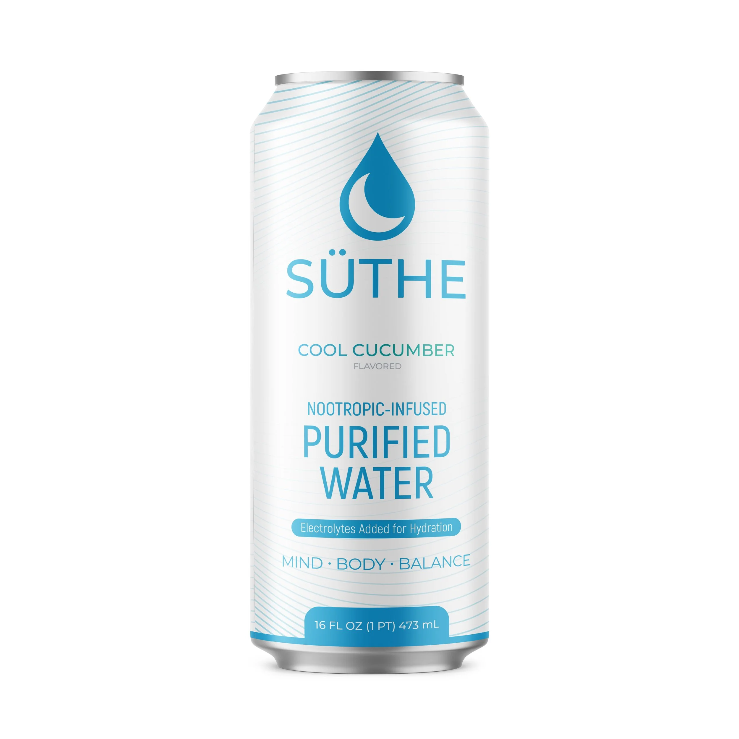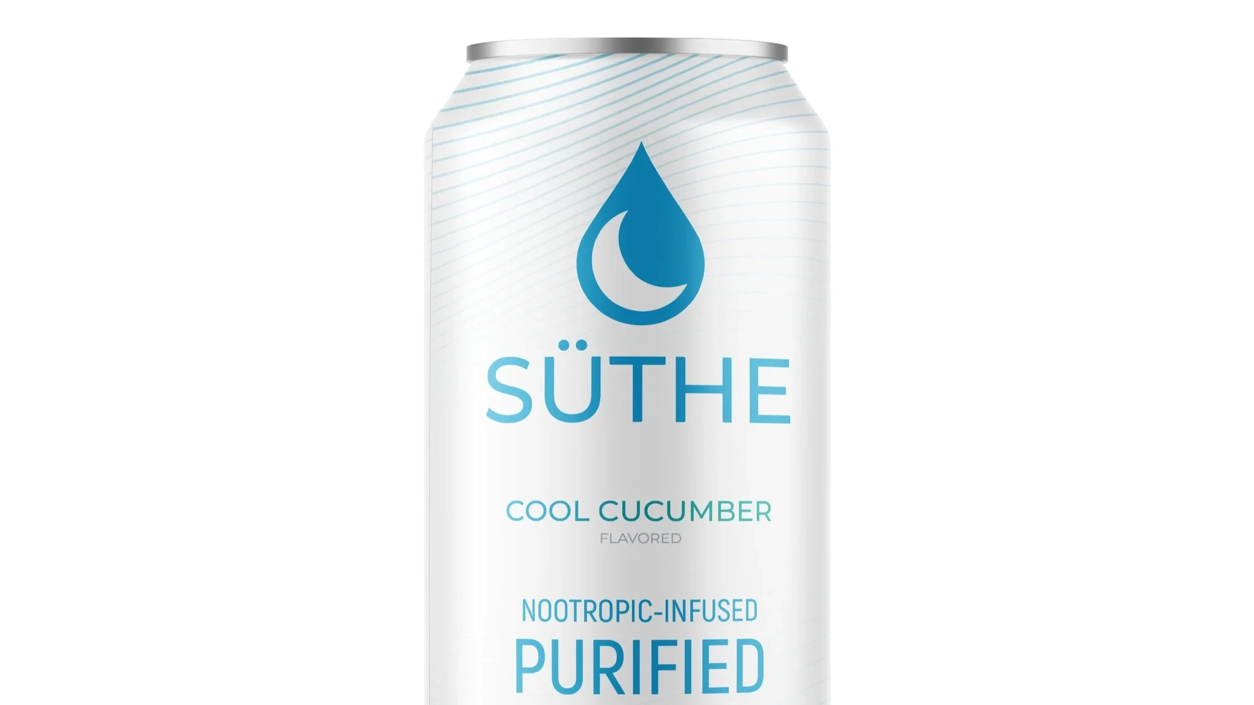
Designing a can label around a new company entering a highly flooded market.
SÜTHE WATER /
The Challenge:
Standing out on crowded retail shelves as a brand-new beverage.
The Solution:
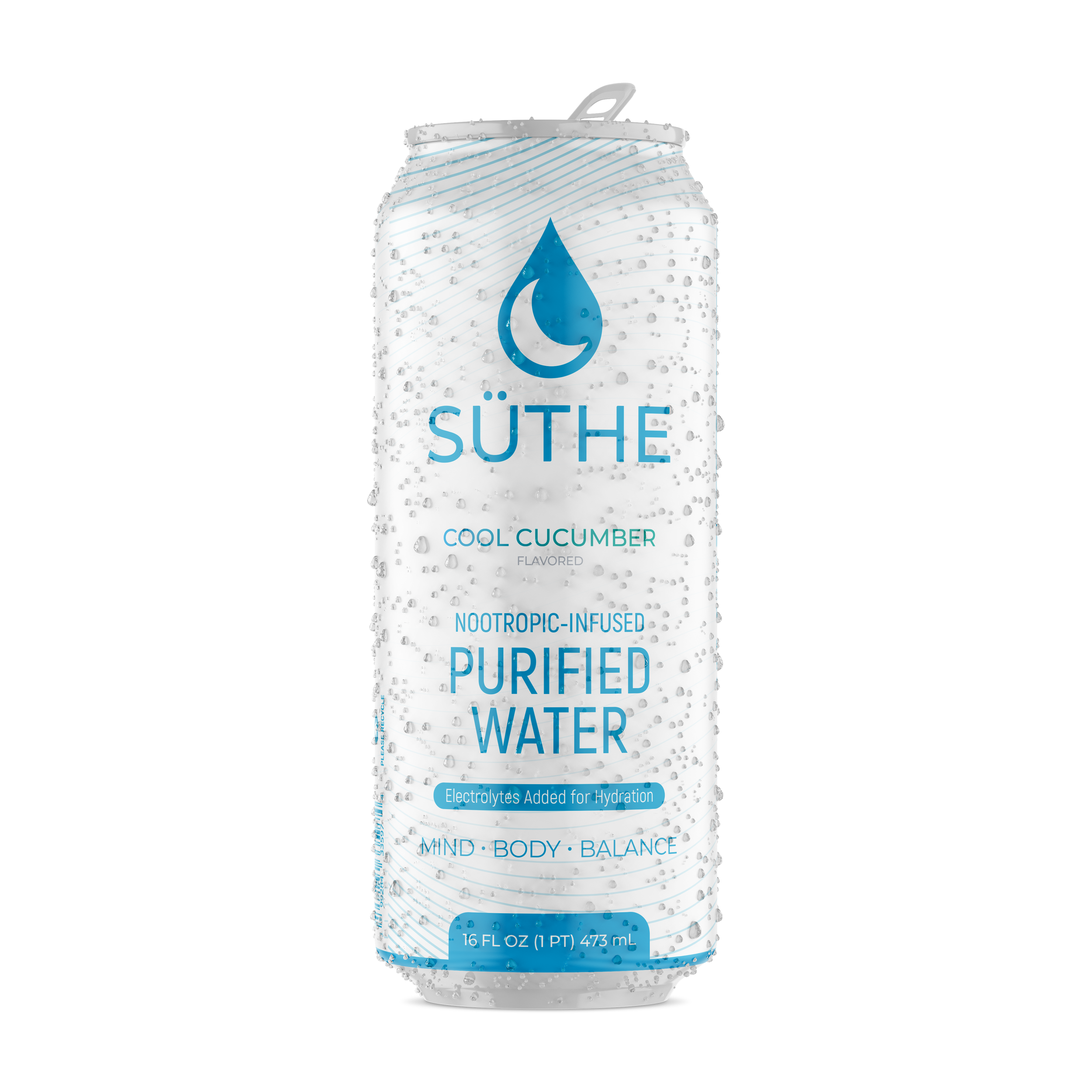
A high-contrast, modern can label design made for instant visual appeal and shelf recognition.

DESIGNING BY FIRE
This project helped me learn by trial by fire. I was heavily involved on team calls and brand decisions. At this time I was newly out of college with only one job under my belt till that point. I quickly adapted and helped lead creative direction with the can label, packaging, website construction, and pitch decks. We built the brand identity around the unique formula, with intent to disrupt a highly populated market.